Design Operations, Product Design, Design Research

Customer Support Features

  • Company: Health Care Service Corporation

  • Role: Product Designer

  • Duration: 2021 - 2024

  • Team: Get Support

Health Care Service Corporation

HCSC is an independent Blue Cross and Blue Shield Association licensee.It is the largest customer-owned health insurer in the nation, serving 23 million BCBS members across Illinois, Montana, New Mexico, Oklahoma, and Texas.

Learn More

Gateway to Managing Blue Cross and Blue Shield Plans

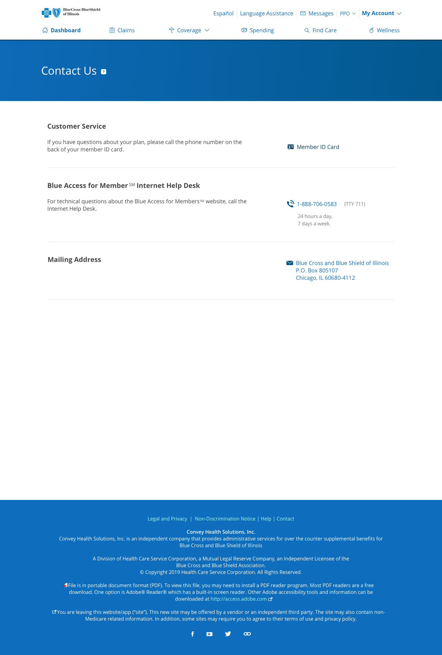
Blue Access for Members (BAM) is an online portal developed by HCSC for authenticated members to manage their Blue Cross and Blue Shield health plans.

Learn More

GET SUPPORT

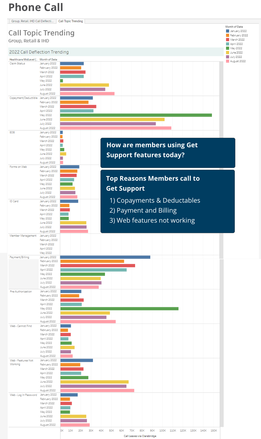
The Get Support team assists members in resolving issues related to their plans by providing over twenty customer service features across four different environments.

Our team works closely with other product teams and the Customer Experience (CX) division to ensure a secure approach when addressing members' questions about their plans and personal health information.

Product Designer

  • UX Designer: I led a redesign initiative focused on collaboration. By engaging with cross-functional partners—including a business analyst, IT project manager, eight developers, and three QA testers—we improved design quality and enhanced understanding of user needs and project goals across the team
  • Human-Centered Design: Conducted research using Human-Centered Design methods to identify user challenges, proposing actionable solutions backed by user testing data.
  • Customer Experience Innovation: Proposed new self-service user flows aimed at enhancing customer satisfaction while reducing call center workload.

Enhance Customer Support

During my tenure at HCSC from 2021 to 2024, I focused on aligning product enhancements with evolving business objectives. My key contributions included:

  • Product Upgrade: Successfully led the transition from BAM1 to BAM2 by migrating the platform to a secure network and implementing a new design system, ensuring consistent front-end user experiences.
  • Prototyping: Developed high-fidelity prototypes for user stories, providing clear guidance for the development team.
  • Data-Driven Insights: Utilized data analytics to identify areas for improvement, particularly targeting segments with lower Net Promoter Scores (NPS).

Balancing Innovation & Compliance

We encountered several significant challenges in pursuing a best-in-class customer service experience. These challenges were primarily rooted in the organization's commitment to safeguarding members' health information. This focus on privacy necessitates strict adherence to a need-to-know protocol, which can limit the agility and creativity typically required in product design.

Navigating these challenges requires balancing innovation and compliance, ultimately guiding our design approach to prioritize user needs without compromising privacy and security.

Final Designs

ExisTIng SiteMap

Product Features

Contact Us

Overview

The "Contact Us" page is critical for members seeking assistance and answers. Despite its straightforward appearance, the backend is complex, connecting various endpoints related to different lines of business. This case study explores the challenges identified in the existing design and outlines the solutions implemented to enhance user experience and improve operational efficiency.

Challenge

The main challenge we faced was call center overload. Our traditional dependence on the call center resulted in a high volume of inquiries, leading to long wait times and frustration for our members. Many users preferred to resolve their issues over the phone, which strained our resources and hindered the development of alternative support channels.

Research

To understand the user experiences and pain points associated with the existing "Contact Us" page, we conducted the following:
  • User Interviews: Engaged with members to gather insights on their experiences in seeking support.
  • Call Center Data Analysis: Reviewed call logs and wait times to identify peak contact periods and common inquiries.
  • Competitive Analysis: Examined how other organizations structure their contact sections and manage member inquiries.

Key Findings

  • High Volume of Calls The data indicated that a significant percentage of calls were related to common issues that could be resolved via self-service options.
  • Call Center Data Analysis: Reviewed call logs and wait times to identify peak contact periods and common inquiries.
  • Competitive Analysis: Examined how other organizations structure their contact sections and manage member inquiries.

Design Solutions

Based on the research findings, we explored several key design solutions to optimize the "Contact Us" section:
  • Enhanced Self-Service Options:
    We discovered that the primary reasons members contact support are inquiries about copayments and deductibles. To address this, we collaborated with the claims and benefits team to identify common issues that can be resolved. As a result, we created an FAQ section organized by categories, allowing users to easily find answers to questions that frequently lead members to call.
  • What actions can we take within our environments?
    As the FAQ section is hosted on a different team's pages, we are only able to suggest changes. The Get Support team is focused on improving our offerings by enhancing our own products and exploring potential changes within our environment.

Design Solutions

  • Design Proposal: Consolidate the Get Support experience into a single centralized Support page.
  • Challenge: The sitemap above shows the current structure of the Get Support features on the site. The pages are organized separately because each pulls different information from various secure API sources based on multiple lines of business and tiered service classes.
  • Future State: While the team focused on stabilizing our environments and fixing bugs in our built environment, I concentrated on the future of our product. I worked with my design teammates to test the new proposed design, aiming to present a final prototype of the new experience to various stakeholders. This would help us gain the team's buy-in to promote a new version of the get support page that aligns with our members' expectations.
Image of updated member ID card page in web, tablet, and mobile mockup view.

Member ID Card

Overview

After successfully migrating members to the new platform, the team's primary goal was to enhance the user experience for one of the most frequently accessed features in the member portal. The focus was on improving usability, accessibility, and mobile responsiveness on the Member ID Card page.

Challenge

Redesign the member ID card page to enhance user experience and provide easier access to essential member information. The primary goal was to simplify the viewing, printing, and downloading of member ID cards and improve the page's overall visual and functional aspects.

Research

Extensive user research informed the redesign process. We adopted an iterative approach involving rapid prototyping and diverse user testing, which allowed us to refine the design based on user feedback.
  • User Interviews: Usability testing conducted on UserZoom and ongoing peer reviews played a vital role in ensuring that the new design aligned with members' needs and expectations.
  • Member ID Card Page Data Analysis: Analyzing usage data collected through member feedback surveys on Medallia.
  • Competitive Analysis: How other organizations structure their member ID card pages.

Key Findings

  • Problem:
    When a member downloads their ID card, it appears distorted, and the front and back sides are on two pages.
  • Design Solution:
    The design guidelines were provided so the development team could standardize the source for retrieving member ID card information.

    The format is designed to fit on 8.5" x 11" paper, with the card's front and back sides displayed on a single page.

    A logo is positioned at the top of the page, adhering to the established guidelines for all documents sent to members.

Key Findings

  • Problem:
    We already have a hyperlink in the Digital Member ID Card description section guiding members in downloading the Blue Access for Members app, but it can be missed.
  • Key Finding
    Research shows that the digital ID card feature is one of the most popular options among members using the Blue Access for Members App on their mobile devices. This encourages us to promote this feature to offer more relevant support to our members.
  • Design Solution:
    We added a new section to the redesigned page that explains how members can access their member ID cards by downloading the app on their mobile phones.
  • ‍I worked with the digital communications team to create the appropriate message on how to download the app, including an image showing how it would look on a phone.
  • When members visit our page on a desktop, the content will provide text-to-download instructions.
  • When members visit our page on mobile, the page will display either the Apple App Store or Google Play badge, directing them to the download page.

Design Solutions

The redesigned page now allows members to view the front and back of the ID card with an enlarged image for better viewing. When members click the download or print button, the ID card is displayed in a stacked portrait format with a logo to meet print format standards. Additionally, a section was added for members to download the BAM App for easy access to their ID cards on their mobile phones, and the order ID card section was updated to provide transparent delivery information.
  • Results:
    The entire redesign process took three months to complete, resulting in a significant improvement in user satisfaction. The new design has made it easier for members to view, download, and share their ID cards while ensuring a consistent brand experience. The overall success of this project demonstrates the positive impact of user-centric design and thorough research in creating a more effective and user-friendly interface for the member ID card page.
View Prototype

Message Center

Overview

After updating the Message Center page from BAM1 to BAM2, we initiated a project with the Voice of the Customer team to identify member frustrations when using the Get Support features. We will contextualize common issues, prioritize tasks based on Net Promoter Score (NPS) data, and focus on the features that received the lowest scores.

Challenge

We implemented Decibel by Medallia, a digital experience intelligence platform, to evaluate the quality of user experiences across our integrated products. Our goal was pinpointing areas where members encountered frustration during their user journey within the BAM2 network.  
  • We worked closely with IT Metrics specialists and Reporting Analysts from the Voice of the Customer team to analyze data and focus on pain points associated with the Get Support products.
  • The project aimed to identify the causes of low Net Promoter Scores (NPS) in the Get Support product line and to address these issues to enhance the overall member experience.

Research

We initiated the project with the Voice of the Customer team to identify member frustrations regarding the Get Support features.

Contextualize common issues, prioritize tasks based on the Net Promoter Score (NPS) data, and focus on the features with the lowest ratings.

Key Findings

  • Problem:
    Specific members are frustrated they can not send outbound messages because they believe it's available to them.
  • Mixed Messages:
    1) We have hidden the "Write Message" buttons and are only displaying the "Inbox" and "Save" tabs for members whose plans do not include the messaging feature.

    2)
    For those same members, we did not remove the "Secure Message Center" option from the Contact Us page, as doing so would mislead them into thinking they could send messages.

    3) The Claims product team recently released an update informing members that they can submit an Out-of-Network claim by sending documents through the Message Center. However, we discovered that this option does not apply to all members, which contributes to confusion, frustration, and a noticeable increase in NPS impact.

Result

After presenting our findings to all stakeholders and validating the causes, the Get Support team conducted a comprehensive audit to identify members with plans that have turned off outgoing message features to help determine who would receive the design update.

  • Solution:

    1)
    We provided this group of members to the Claims team, enabling them to update their page and ensure that the message remains consistent across the platform.

    2) The Get Support team has updated the Message Center page by disabling the "Compose Message" button and adding an alert at the top of the Inbox section. This alert notifies users that this feature is unavailable and offers an alternative way to contact us for support.

    3) We hid the Message Center section to reach us on the Contact Us Page.
    turning off
Results
As a result of our collaborative efforts, the customer support features were enhanced and successfully provided members with a more intuitive and efficient support experience. Introducing BAM2 and the new design system resulted in a more cohesive and user-friendly portal, ultimately improving member satisfaction and engagement.
Lessons Learned
This project emphasized the significance of proactive collaboration, high-fidelity prototypes, and detailed documentation to implement new designs on time successfully. It also underscored the importance of securing buy-in from all team members, making each one an integral part of the process, to reduce technical debt and successfully adopt new enhancements

Next Case Study

Customer Service Relations

Enterprise Program For Call Center Agents

Learn More

EMO Health App

Visualizing Emotion

Learn More